Tuesday 24 November 2015

Contents Page Construction Phase 1


I have used InDesign to start my contents page. I have used the same background as on my frontcover and I have kept to my colour scheme. I have kept the same font but i have changed it around a little on the red box at the side of the page title. i have changed the layout to make it look better and more professional then it looked on my flat plan. I will included my images later (where the boxes with X's in them are) to complete my contents page.

Tuesday 17 November 2015

Final Magazine - Flat Plan


I have created a flat plan for my final magazine. I have chose a design that I believe will make the most of the space I have available while remaining stylish and effective.

Wednesday 11 November 2015

Institution Research


I have researched Music Magazine Institutions and have made a table showing some information about each and some of the magazines they publish.

Tuesday 10 November 2015

InDesign Practice Poster

I have used Adobe InDesign to create a poster. This is for practicing how to navigate and use InDesign effectively in ways that look good. I messed around with images and text, changing colours, adding borders and trying to use the program to have full effect.

Double Page Spread Deconstructions


Double page spread deconstructions from Courtney

I have deconstructed four different magazinge double page spreads.

Tuesday 3 November 2015

Preliminary Task


I have completed the preliminary task of creating a practice magazine. I included the key aspects of a magazine and also used some techniques I have mentioned in my earlier posts. I tried to sick to a colour scheme (my chosen colours red, blue and yellow) to make it look mature and stylish. I used photos that fitted in with what i wanted and attracted attention without ditracting from the text. I tried to make it seem interesting and like something that you would want to read.


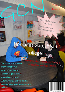
For my offical assesment I think I should change the layout and style of the front cover as I think it could be greatly improved. I think the bubble on the front cover is very ditractiong and takes away from the mature look. The text on the front cover is also hard to read at some point because of the poor visability allowed by the font colour against the background. Overall I think I did a good job but it can be improved very much.