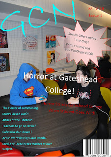
I have completed the preliminary task of creating a practice magazine. I included the key aspects of a magazine and also used some techniques I have mentioned in my earlier posts. I tried to sick to a colour scheme (my chosen colours red, blue and yellow) to make it look mature and stylish. I used photos that fitted in with what i wanted and attracted attention without ditracting from the text. I tried to make it seem interesting and like something that you would want to read.

For my offical assesment I think I should change the layout and style of the front cover as I think it could be greatly improved. I think the bubble on the front cover is very ditractiong and takes away from the mature look. The text on the front cover is also hard to read at some point because of the poor visability allowed by the font colour against the background. Overall I think I did a good job but it can be improved very much.

Courtney, you have completed your preliminary task, and identified areas for development when it comes to the construction of the main task.
ReplyDelete