Thursday, 3 December 2015
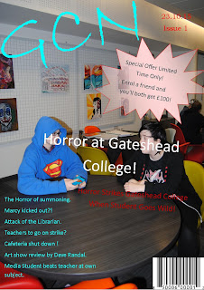
Front cover Construction Phase 2
I have taken screenshots to show the progress of my work and to show improvements and changes that have been made.
Contents page Construction Phase 2
I have taken screenshots to show how my work has progressed. These are the screenshots from my contents page.
Tuesday, 1 December 2015
Tuesday, 24 November 2015
Contents Page Construction Phase 1
I have used InDesign to start my contents page. I have used the same background as on my frontcover and I have kept to my colour scheme. I have kept the same font but i have changed it around a little on the red box at the side of the page title. i have changed the layout to make it look better and more professional then it looked on my flat plan. I will included my images later (where the boxes with X's in them are) to complete my contents page.
Friday, 20 November 2015
Tuesday, 17 November 2015
Final Magazine - Flat Plan
Monday, 16 November 2015
Analyst of last year's student work
Looking at previous student work from Courtney
I have analysed previous students work and said how their work has helped me.
I have analysed previous students work and said how their work has helped me.
Friday, 13 November 2015
Wednesday, 11 November 2015
Institution Research
I have researched Music Magazine Institutions and have made a table showing some information about each and some of the magazines they publish.
Tuesday, 10 November 2015
InDesign Practice Poster
I have used Adobe InDesign to create a poster. This is for practicing how to navigate and use InDesign effectively in ways that look good. I messed around with images and text, changing colours, adding borders and trying to use the program to have full effect.
Double Page Spread Deconstructions
Double page spread deconstructions from Courtney
I have deconstructed four different magazinge double page spreads.
I have deconstructed four different magazinge double page spreads.
Tuesday, 3 November 2015
Preliminary Task
I have completed the preliminary task of creating a practice magazine. I included the key aspects of a magazine and also used some techniques I have mentioned in my earlier posts. I tried to sick to a colour scheme (my chosen colours red, blue and yellow) to make it look mature and stylish. I used photos that fitted in with what i wanted and attracted attention without ditracting from the text. I tried to make it seem interesting and like something that you would want to read.

For my offical assesment I think I should change the layout and style of the front cover as I think it could be greatly improved. I think the bubble on the front cover is very ditractiong and takes away from the mature look. The text on the front cover is also hard to read at some point because of the poor visability allowed by the font colour against the background. Overall I think I did a good job but it can be improved very much.
Tuesday, 20 October 2015
Preliminary Flatplans - Cover and Contents pages
Preliminary Flatplans - cover and contents page
I have made a basic flatnote for my preliminary task to show how I will set out my front cover and contents pages.
- My front cover will have an image of the college on it, along with special offers and other basic magazine aspects. Along with things such as the masthead, date, issuse number, barcode and images there will also be coverlines and a sub-head hinting at the "inside" of the magazine.
- My contents page will have an image of the college library with two people sat at one of the tables. It will also have other smaller images that were taken around the college, as well as coverlines and enigma codes. This will make my magazine more effective and gain more marks.
Tuesday, 13 October 2015
Photoshop experiments
I have edited some photos I took on Photoshop and played around with them a bit. I did this to prove I have used Photoshop before I do my magazine cover, contents page and two page spread. I have only included two basic examples of my work.
Monday, 12 October 2015
Magazine Contents page Deconstructions
I have deconstructed three different magazine contents pages and posted them on wordpress.com. I have then share the link here as well.
Friday, 2 October 2015
Magazine Front Cover Deconstructions
I have deconstructed three magazine covers and compared two of them. I have uploaded my presentation to slideshare.net and have copied the html link here.
Friday, 18 September 2015
Key features of a magazine cover
I have use Photoshop to create an image showing all the key features of a magazine cover.
I have labeled the key features that are widely use in many different types of magazines.
The Masthead is the name of the magazine which is sometimes shortened if it is to long.
Essential Info is usually in the top left corner of the cover, under the Masthead, and contains the date, issue number, the price and the web address. However this particular magazine doesn't seem to have any.
The Main Coverline is an enigma that teases the audience, hinting at the hidden secrets of the magazine, drawing them in.
The Sub-Head is a few short lines that explains the Main Coverline, giving slightly more information.
The Coverlines hint what other secrets the magazine hides.
The Main Image builds identity of the magazine and is the main attraction to the target audience.
Sub-Images are the other smaller images that are either at the bottom or sides of the Main Image.
Bubbles draw your attention to any offers or challenges the magazine has to offer.
Subscribe to:
Posts (Atom)


